Opti-sizing* your Web Page
*Optimizing the size of your
webpage
Of the millions
who browse the web, there are many tastes, abilities and computer
settings. We as web designers are in a position to optimize our
sites for any computer setting if we want. But what about optimizing
for all computer settings? This discussion is about verifying your
pages' design "works" in most any resolution.
Most site visitors
view a site in 800 X 600 resolution. However, it would be a mistake
to ASSume that all visitors will be
viewing in that resolution. Infact, with the sales of new computers
with better display adaptors and larger monitors, many users are
swwitching to higher resolutions.
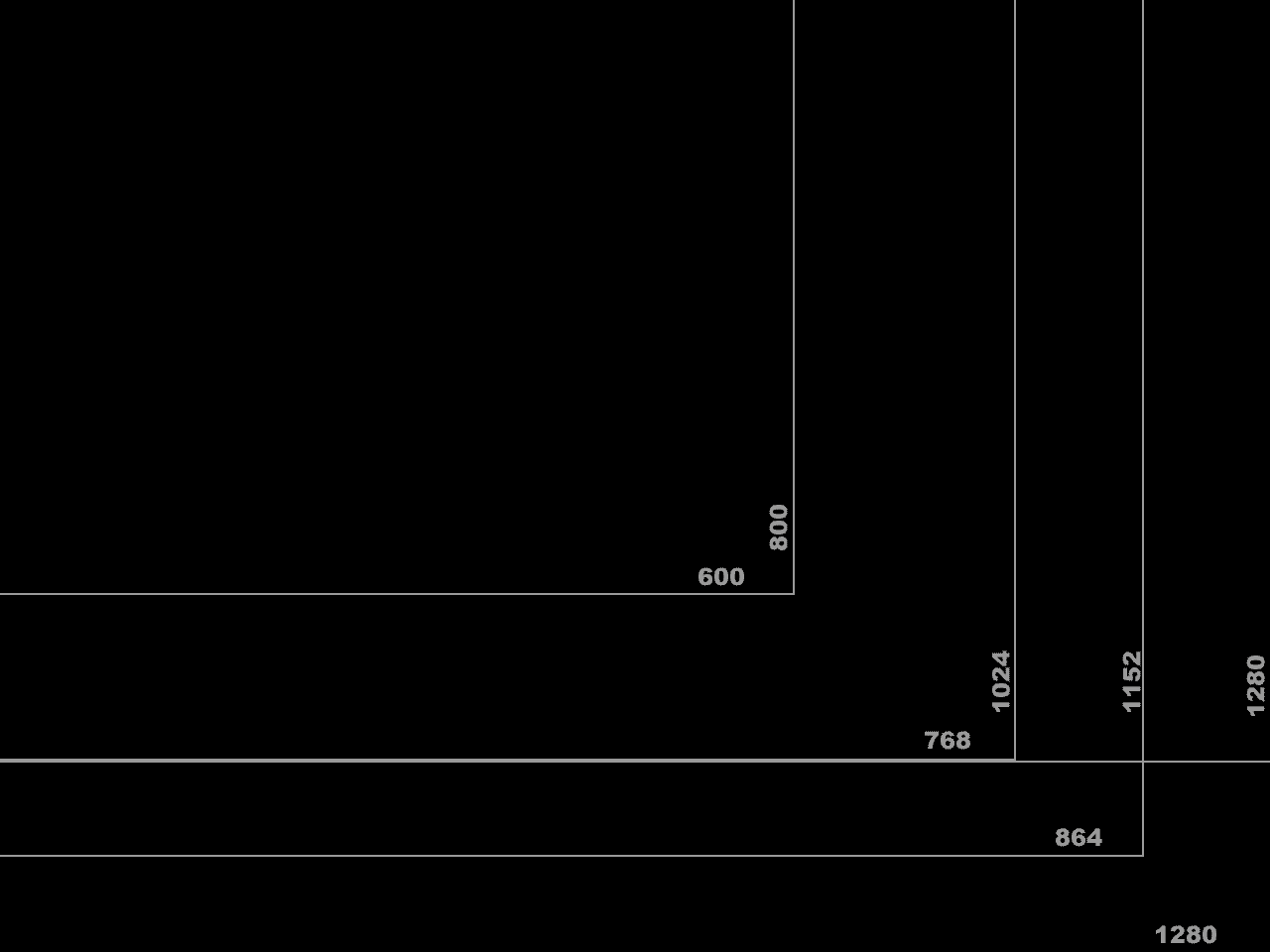
I have an image I
use on my high resolution background that allows me to judge the
appearance of pages in a variety of resolution. First I set this
image for my background. I work in very high resolution so the
background shows most common resolutions for page viewing.
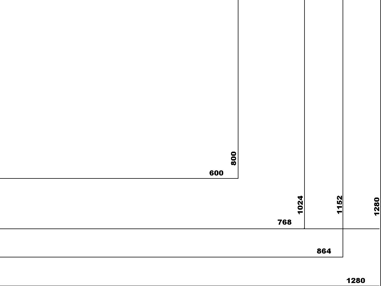
1. Download this
image desktop.gif. (Or transparent
version desktoptrans.gif with
blacklines or
desktoptrans2.gif with white lines)
Right click on the link and save it to your hard drive. Below is an
screen shot of this image on a desktop.
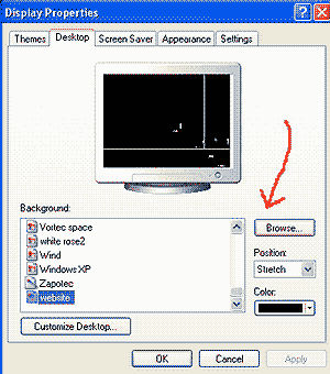 2.
Set this image as your desktop by right clicking on your desktop and
selecting properties. 2.
Set this image as your desktop by right clicking on your desktop and
selecting properties.
3. Select the
desktop tab.
4. Browse for the
file desktop.gif. Select it and click OK.
5. Click APPLY and
OK.
6. You may want to
set your browser resolution up on the settings tab to view more
resolutions. Follow the advice of your video adaptor for resolution
restraints.
7. Then open the
site in a browser and resize the browser window to fit the
appropriate dimensions (outside perimeter). Review your site
for publication in different resolutions. |


